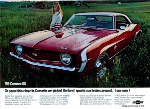
A pretty girl with a red and white Camaro. Why was she driving through a grassy field? Image courtesy lov2xlr8.no.
For the life of me, I’ve always been glad I never majored in advertising. If it were my job to come up with the slogan or image that would help put a company on the map, or save them from going down the tubes, I’d be doomed. That being said, I do know good advertising when I see it because it compels me to learn more about what I just saw or heard.
When it comes to car advertisements though, especially classic car advertisements, most of the time I walk away scratching my head. Chevy is no slouch in having had some great advertising over the years, but they’ve had their head scratchers too. Let’s take a look at a few ads from the year of Chevys that a lot of us still can’t get enough of, 1969.
To begin, look at the Camaro image at the top of this page. The girl is pretty, and the color contrast of the red and white Camaro against the grassy field is stunning. The chrome on the wheels looks stellar. The raised white letter tires are positioned with the words at the top, and everything is nice and symmetrical. Visually, it’s great, but once you start to noodle on the reasoning of the ad it becomes confusing.
To begin, why is this Camaro in the middle of a field in the first place? Did the girl drive it there, or did her boyfriend get lost after a Sunday drive? It’s a nit picking point, I’m sure, but the Camaro is supposed to invoke images of speed and feelings of masculinity. This one makes me want to pack a picnic basket. Other than the fact that this ad is eye-catching it does nothing else for me. Moving on.

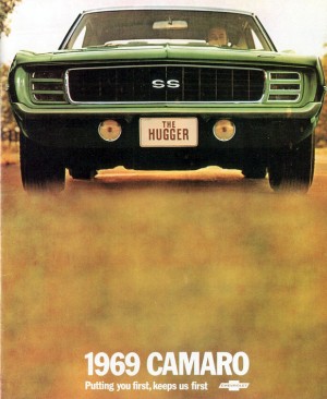
A '69 Chevelle running strong.
This Chevelle ad is a step up from the Camaro ad, but still has it’s issues. The first item that I notice is that the guy driving is doing a little wheeling, and wheeling is fun. He’s hustling fast enough to kick up a lot of dust, and as we all know, flying dust behind a car represents speed. I also like the bold arrogance of the ad leader text, “If our competition had one like it we’d have a lot more competition.” I like statements like that.
With muscle cars, it’s all about being bold and arrogant, so if you’ve got it, flaunt it! After that though, the ad fizzles. The content text of the ad is decently informative but majorly boring. After reading it I didn’t say “Yeah!” but instead I said, “Meh.” I was then a little annoyed that somehow this guy can drive quickly on gravel while keeping his Chevelle spotless. I’d like to know how to do that trick.

This is how it's done! A great '69 Camaro ad.
Now this is how it should be done. The sexy sheet metal of the ’69 Camaro is on full display, hidden headlights and all. As any photographer will tell you, it’s always best to fill the frame, and this ad does that perfectly. That Camaro couldn’t get any wider. It looks like it could eat the road up and spit it out it’s tailpipes. The colors are visually appealing, just as they are in the first ad.
Unlike the first ad though, there isn’t much to get distracted by. This Camaro got here by driving here, not by magically leaping from a road a quarter of a mile away. There is no boring text banter in the ad to become annoyed by. It’s just a really cool ad for a really cool Camaro, and a good example of what advertising should do. I want one!